Visual design for artists & progressive organizations
Before starting the label, I worked as a creative director and designer for close to three decades. That experience now supports artists releasing records through IviBob Records and a small number of outside clients each year.
I have curated a collection of projects that I hold dear to me over the years. There’s a lot of brain power and collaboration in these pixels that I am proud of. Enjoy and if you have a visual design or brand identity project that might seem like a good fit… please reach out.
LOGO DESIGNBoston-based, Agency Robotics, aims to improve commercial sorting facilities with their brand of autonomous agents. The strategy for this logo design exercise was to give prominence to the characters in the name "agency" and also designing a supportive icon using typography as objects that visualizes the objective of building a self-empowered, inspired team. (2024)


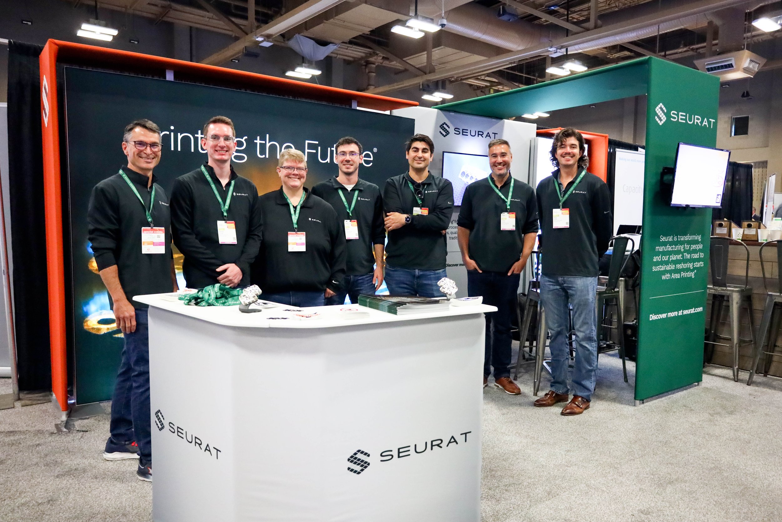
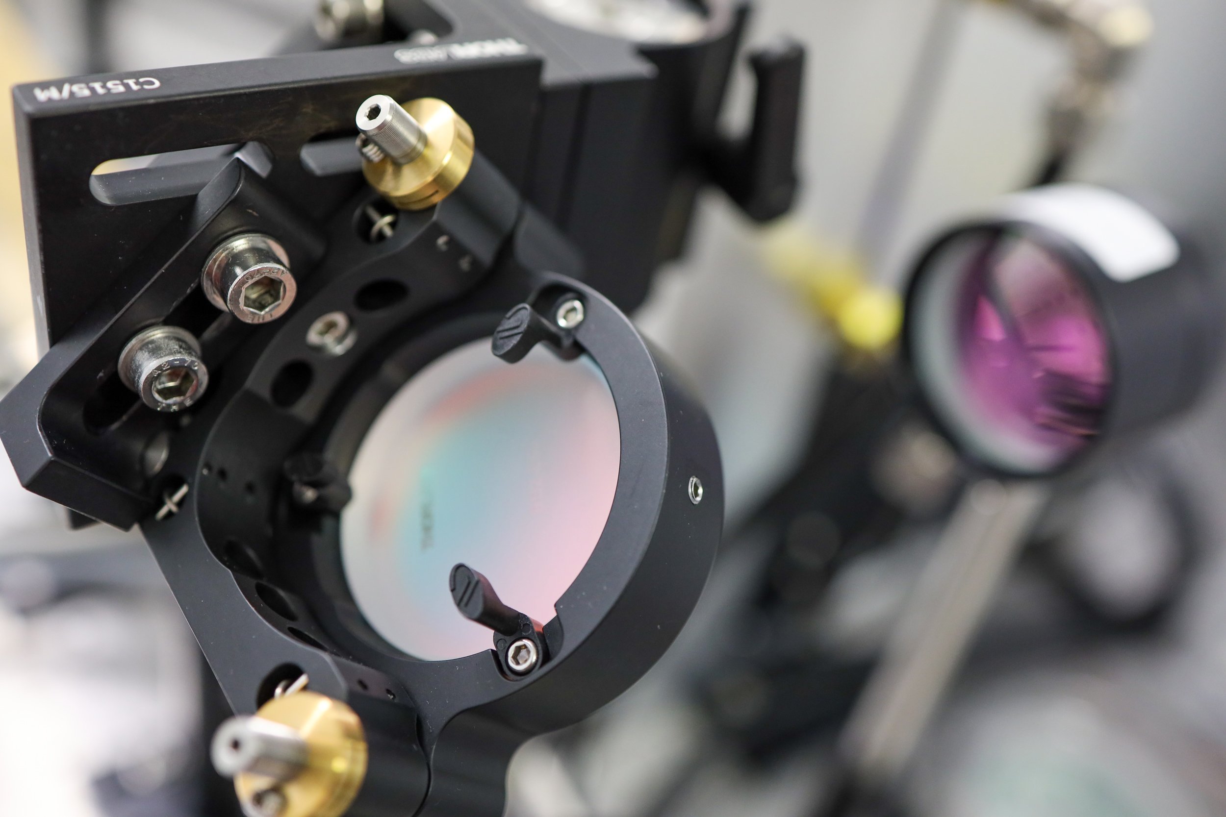
BRAND IDENTITYAs Seurat's in-house Creative Director from 2021-2023, I was on-site and on-assignment capturing and publishing the growth of the company first hand. Seurat developed and patented “Area Printing” which has the potential to break through the limits of today’s metal additive manufacturing industry.


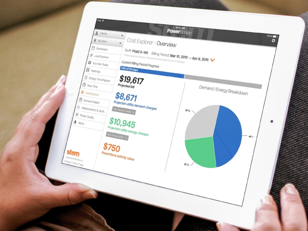
BRAND IDENTITYEnergy storage was a relatively new industry in 2012. Crafting an identity for the one of the pioneers in the space, Stem, was no small task. Budgets were low, and impact was paramount. I was Stem’s in-house Creative Director from 2012 to 2015.


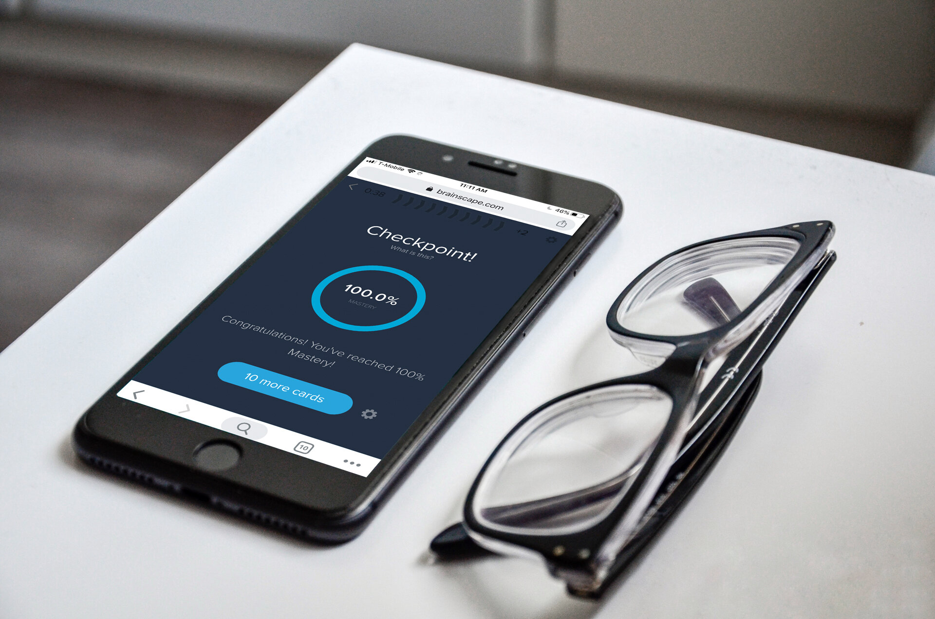
BRAND APPLICATIONBrainscape helps you push yourself. Learning from failures is the very mechanism by which the human brain develops. Brainscape was created to help you identify and quantify your mistakes as quickly as possible, so that you can turn them into your greatest strengths. No pain, no gain. (2020)

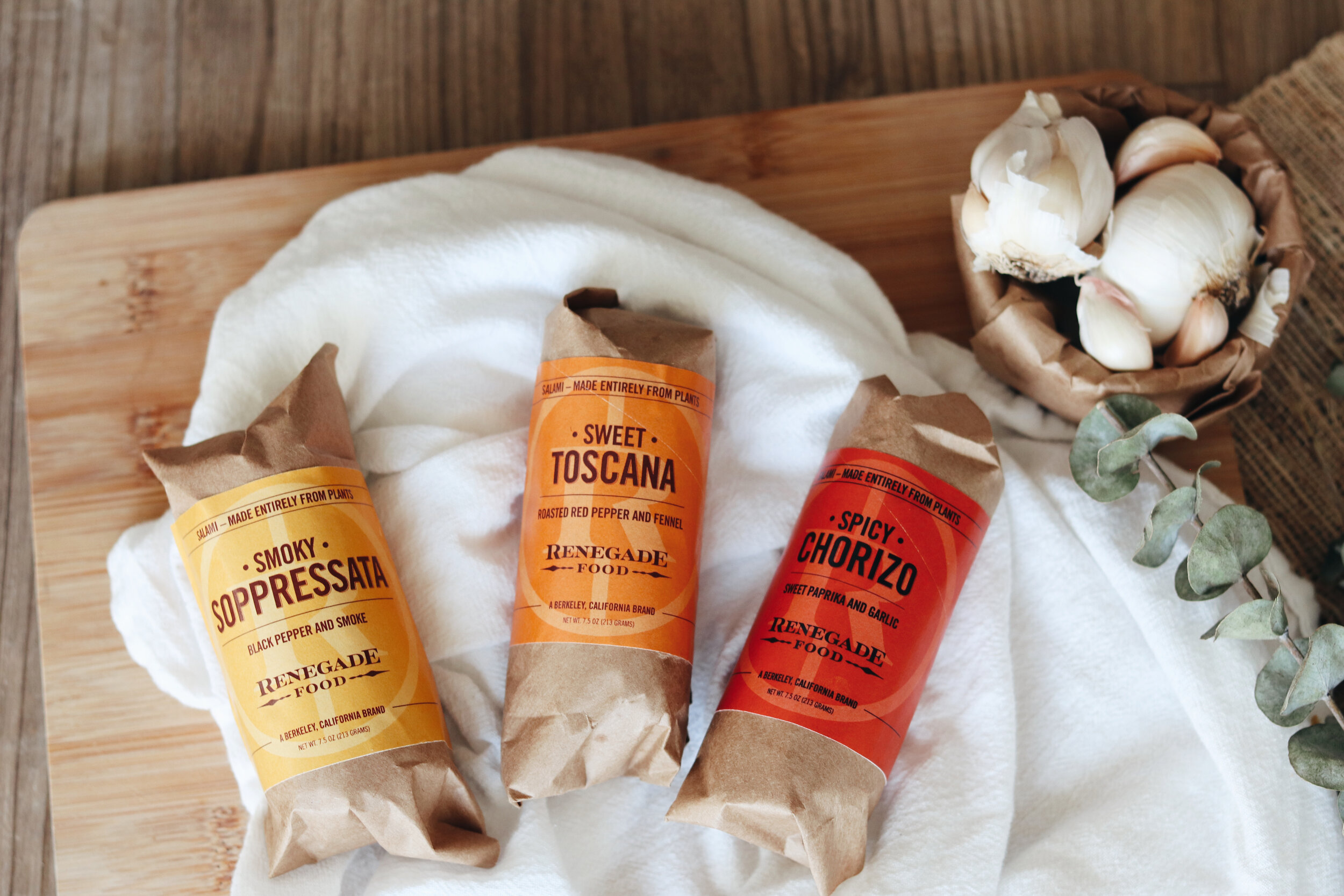
LOGO & IDENTITYRenegade desired a logo that felt familiar to California’s wine country. Exclusive, but attainable. As the first of their hallmark products came to market, the project included the design of their packaging and labels. The objective was to reinforce the bold, branded look of their logo and iconography with strong, flavor-filled colors and delicatessen-like typography treatment to elevate the brand on shelves and at tasting events. (2019)

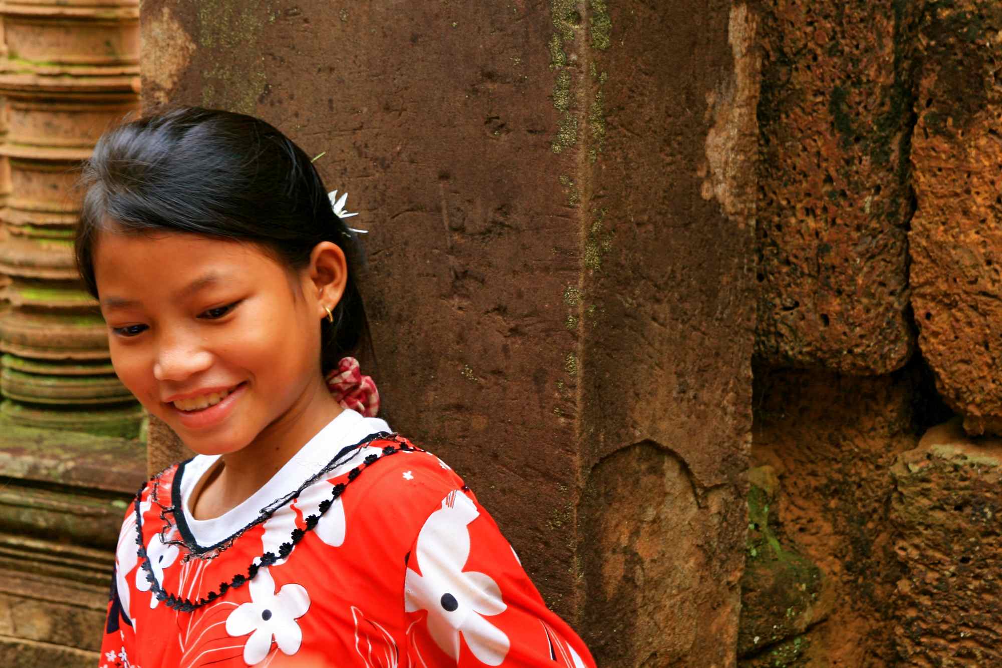
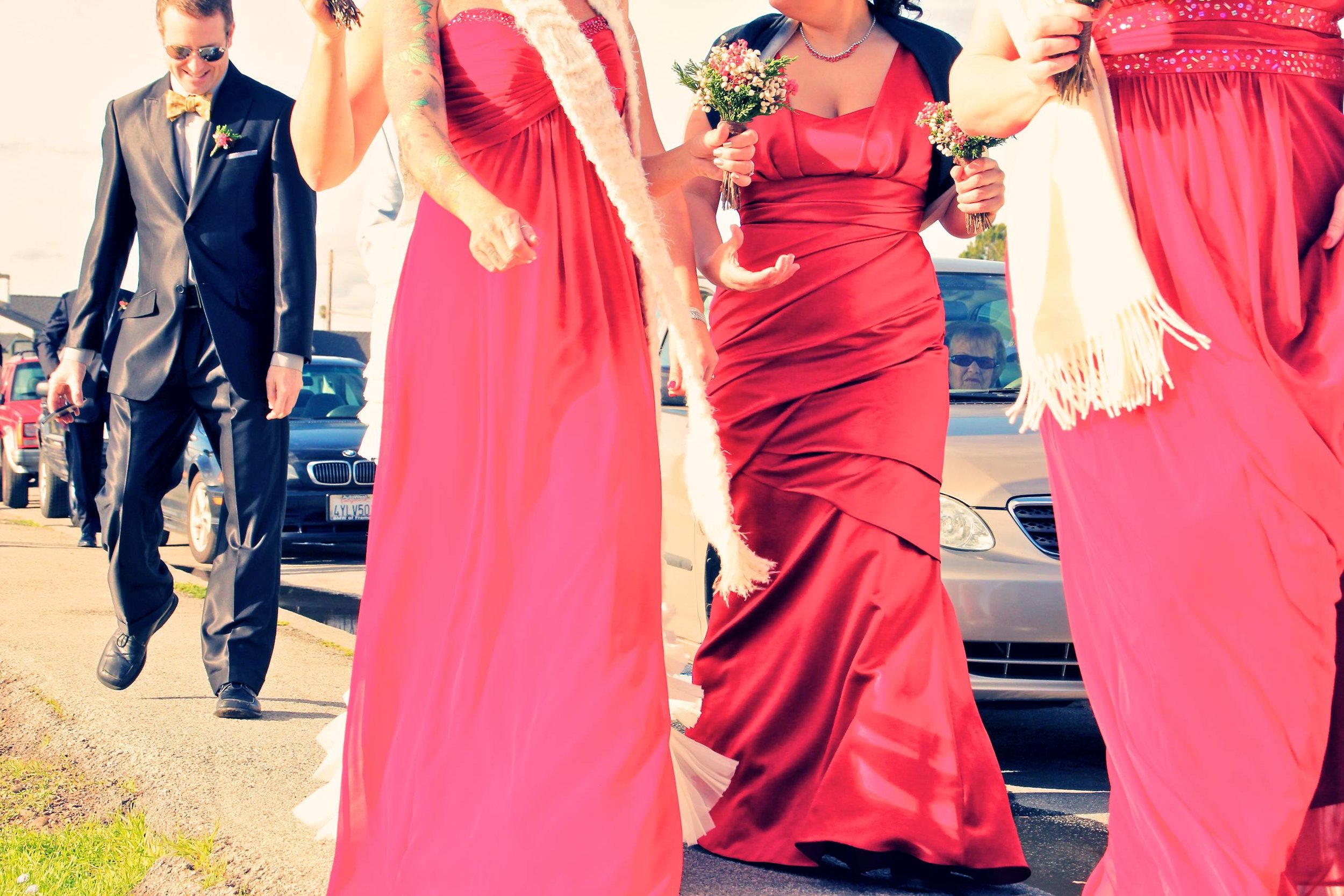
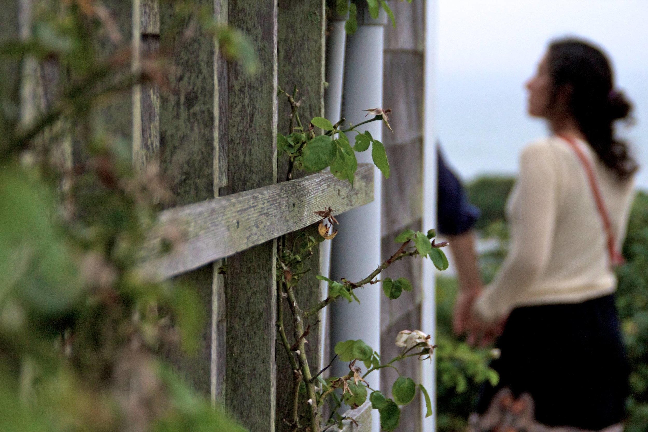
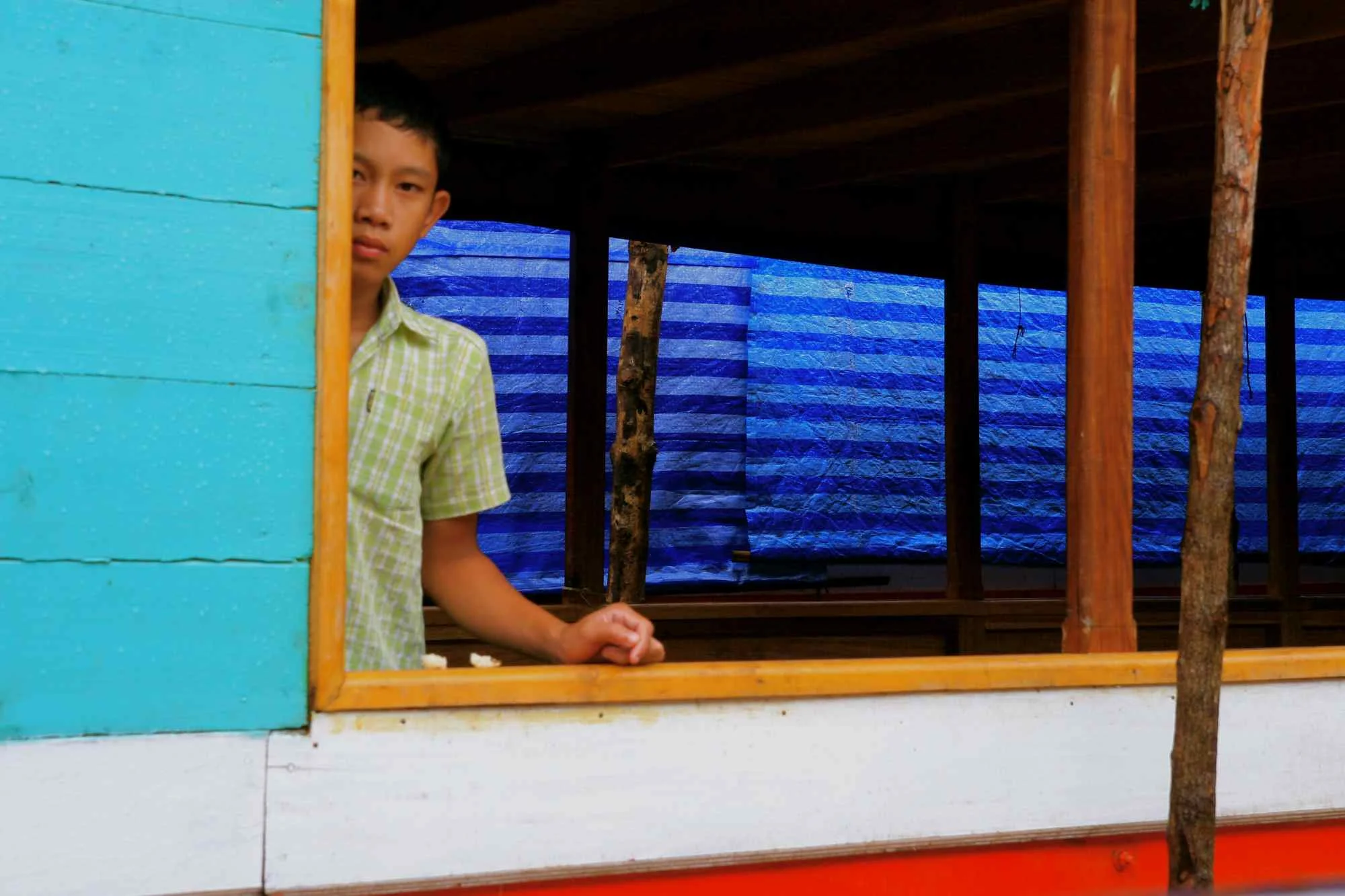
PHOTOGRAPHYCapturing moments are some of my favorite moments. The gallery below contains photographs taken throughout my career.


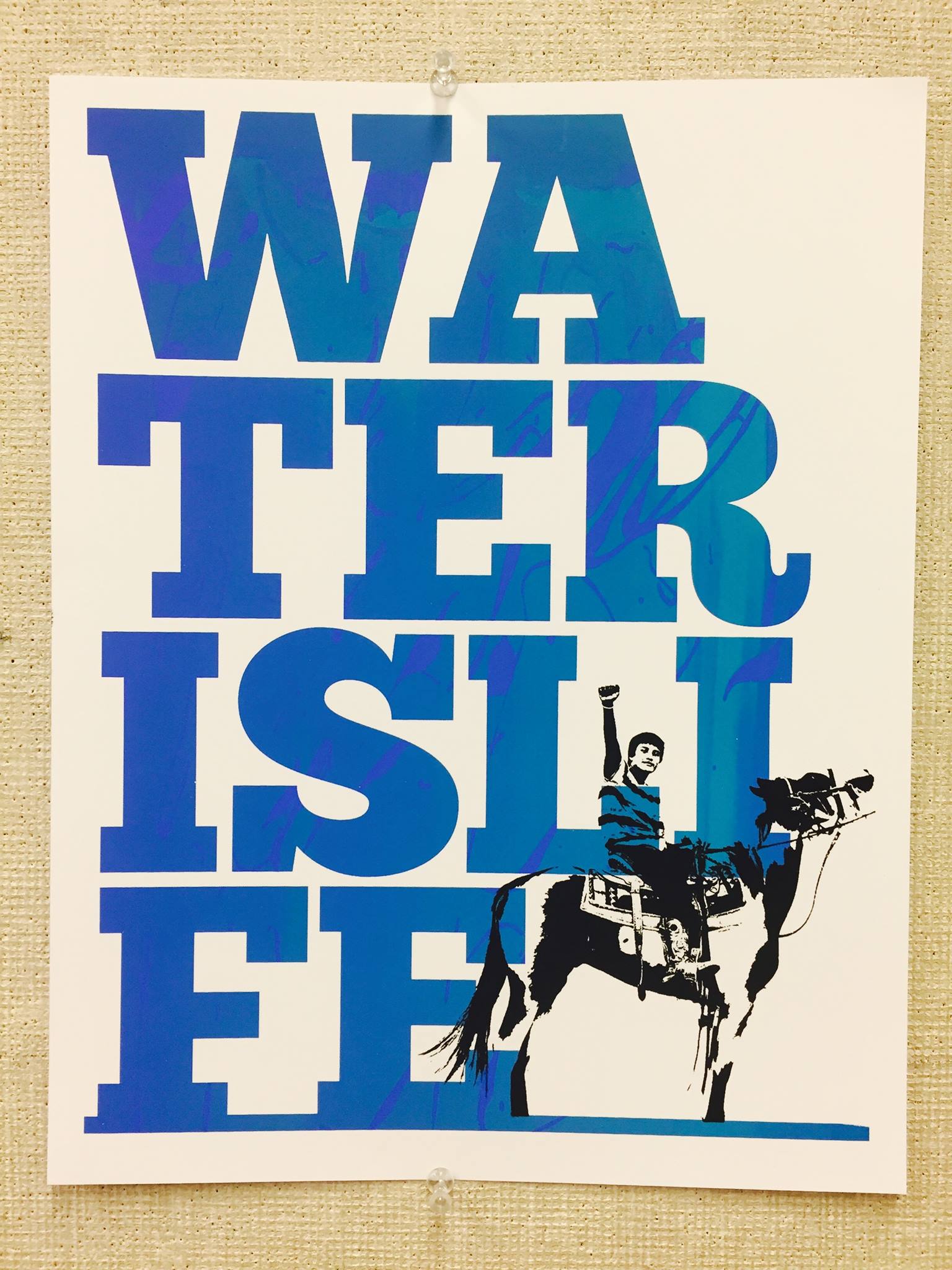
LOGO DESIGNFor thirty years, I’ve had the pleasure and honor of designing logos for brands that I align with—positive, forward-thinking, progressive efforts that do the world good. These are a few that rise to the top. (1998 – 2024)


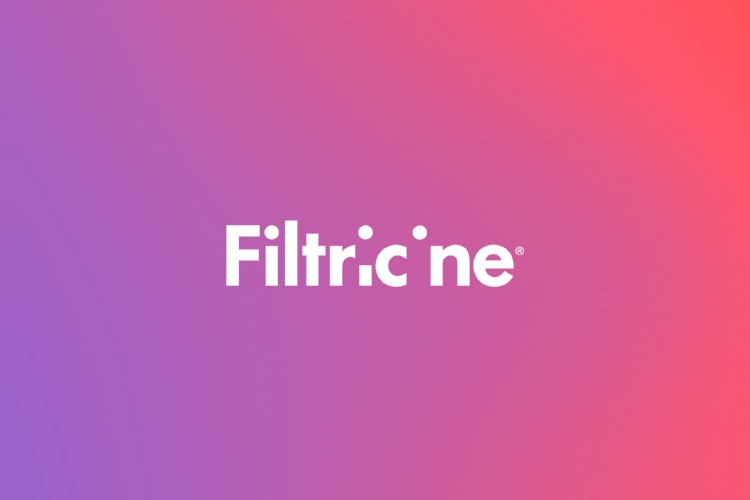


LOGO DESIGNFiltricine was in need of a complete logo/identity design with very little time to deliver prior to their product launch. Their brand proposition is simple: Kill cancer. Drug-free.
By depriving cancer cells of essential amino acids, Filtricine destroys cancer cells without the side-effects of more traditional cancer treatments. It’s a true-to-form disappearing act that will save lives. (2016)

LOGO DESIGNAnglit is a conceptual application for navigating the world of fly fishing excursions. It takes the desire to be on a river and pairs it with the guides who can make it happen and make it memorable.
As a guide-focused service, Anglit points customers to the importance of guides, while preserving the mystique around local information—typically only held by guides and fly shops.
The shape of the anglit icon was inspired directly by the oblong and organic shapes of river rocks.


CONCEPTUAL DESIGNSJust a peek into random projects that come my way.
Including the honor to be chosen as “Sticker Man” at Burning Man. My sticker designs were chosen out of an annual global competition three years in a row as the official sticker for the annual arts festival held annually in Black Rock City, Nevada. (2009–2011)